- Client: Daoust Siroy
- Year: 2019
- Project type: Agency
Take a quick tour of the law firms in your area and you'll see that design and brand identity aren't necessarily high on their list of priorities. Daoust Siroy asked us to develop a flexible brand platform that could adapt to their growth. We were more than happy to help them stand out from the crowd, not just a little.
- Branding


A striking symbol.


Each angle is calculated.
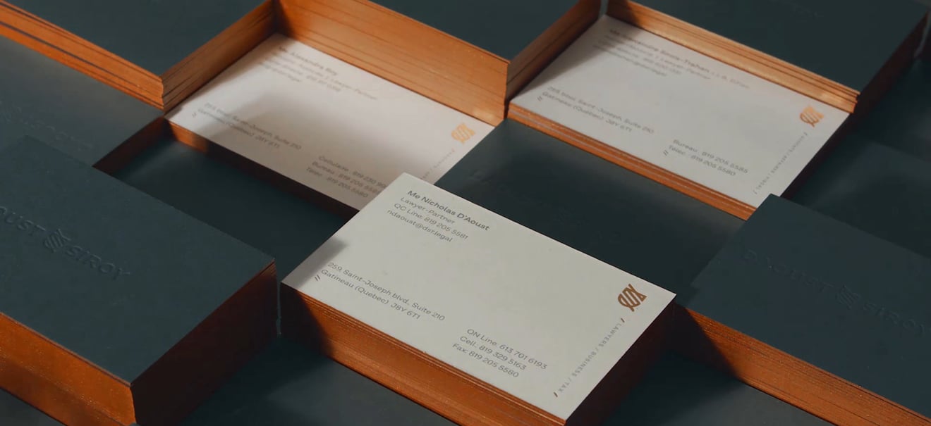

Look, it's shiny.

Copper edges reminiscent of prestigious law books.

Diagonal stripes define the system.

We're crazy about bronze!

The official seal.


Lawyers in motion, like their logo.


